This week we discussed apps and whether they were good or bad and the design behind them. We need to consider the design of the app and with that how easy it is to access for the end user. We were each assigned an individual topic to research relevant apps. The topic that I had been assigned is Food and Water Waste.
After a quick bit of Googling I found this site: http://england.lovefoodhatewaste.com/node/5825
The Love Food, Hate Waste website tells you about an app you can use to try and help you use up everything in your cupboards and fridge without throwing anything away. I downloaded the App to find out more.
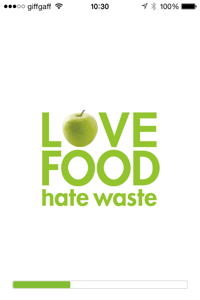
Upon loading the app on my phone I was presented with a splash screen with a loading bar, splash screens seem to have become fairly standard but the addition of a progress bar of how far the app is to being loaded is unnecessary. I quite like the logo, nice and simplistic, replacing the O with an apple is topical to the app and works.
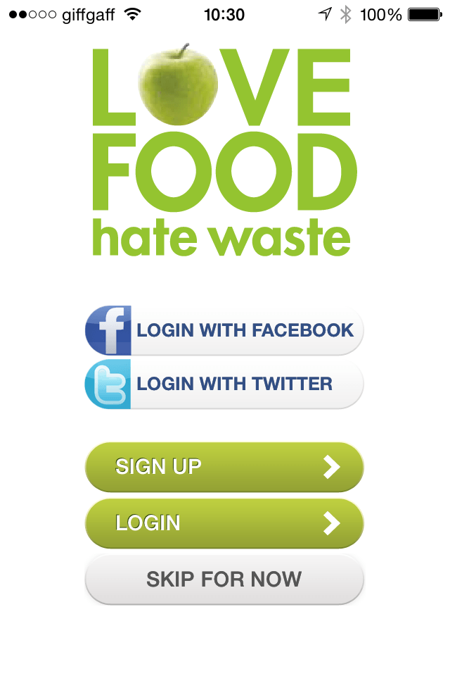
The next thing you see after the splash/loading screen is a sing up/login screen, this is made easy with the login with social media buttons but I feel hat this is another obstacle between the user getting the content they need quickly. The colour scheme works with the bright greens which is associated with food/cooking/groceries.
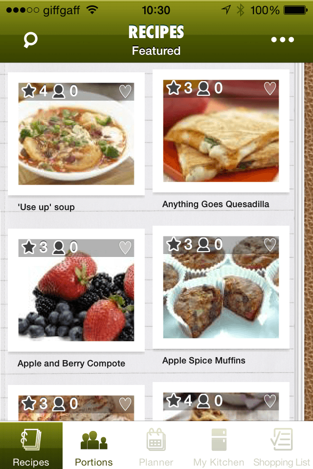
Once you pass the login screen you are presented with various recipes which you can follow to make some meals. The colour scheme all changes on this page for some reason and doesn’t fit the the lighter greens of the login screen, it’s far too dark. Minimal buttons along the top are quite good.
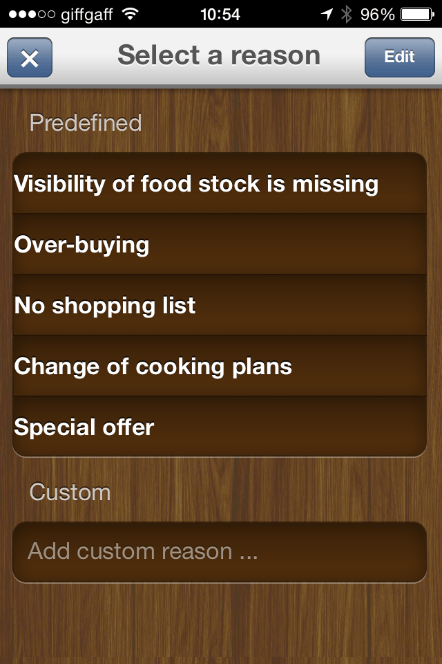
The second app I investigated was called Food Waste, this app helps you track all of the food you throw away and why. as soon as I opened the app i was simple thrown into it with no instruction of what I was meant to do, the screen itself doesn’t actually mention food or drink in any way at all. you are simply presented with a bunch of boxes. The wood background aesthetic is sort of nice but ultimately unnecessary. Upon tapping one of the boxes you are presented with a drop down menu which is fairly simple to use, the buttons at the top haven’t been designed in accordance with the rest of the app.